Brights Advisory brand identity
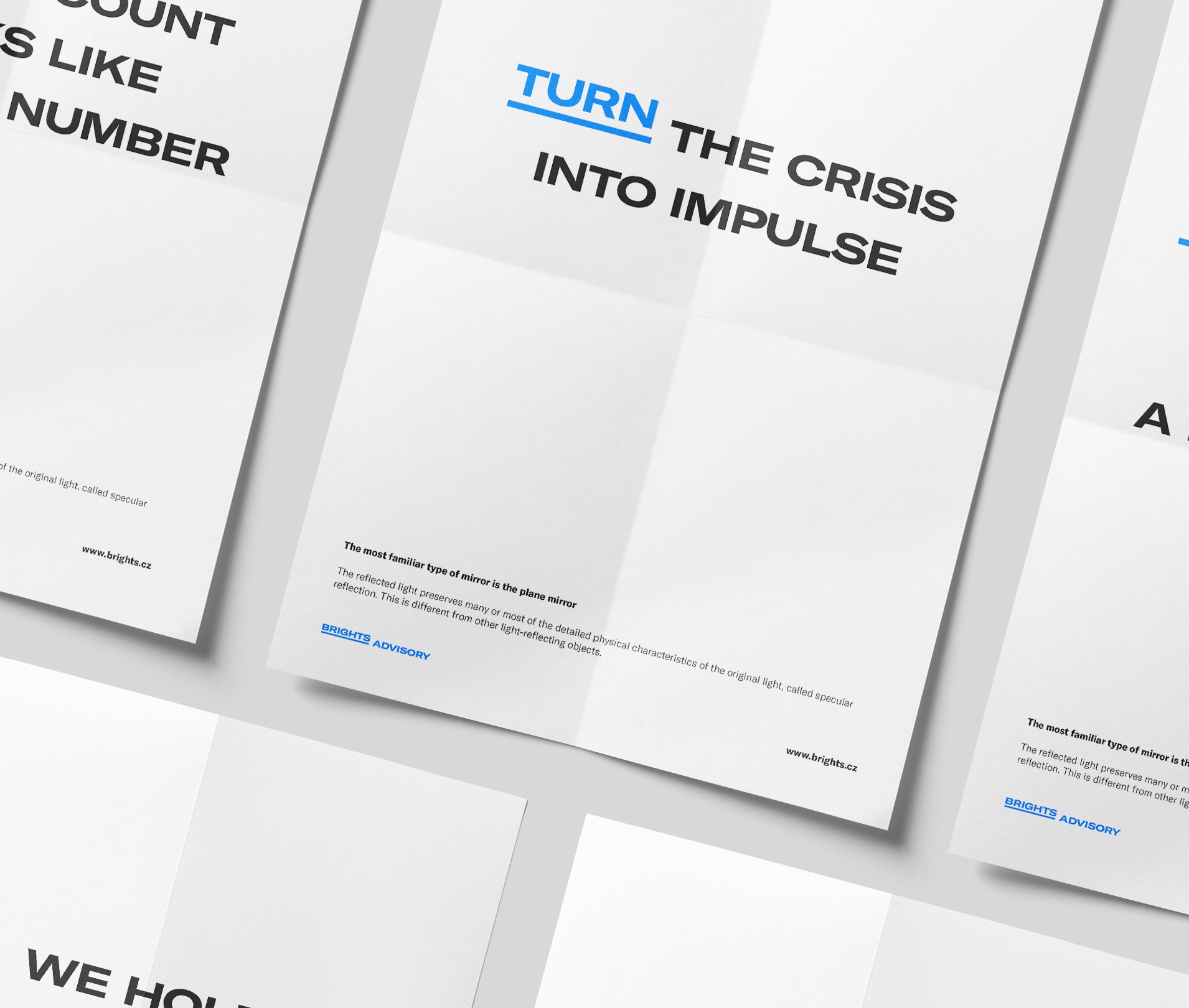
Brights Advisory is a strategy, management and operations consulting firm that implements their recommendations on the basis of their knowledge of people. Its brand identity is based on a minimalistic approach with a typographic logo without any specific symbol.
Role: branding, art-direction, digital, motion

Branding involves working with an underlying concept, which highlights the company actions for better result. The present iteration was based on a "no-logo" idea. Good design means as little design as possible. A good logo is one which does not look like a logo. That is because it concentrates on what matters and the logo is therefore not weighed down by non-essential elements.
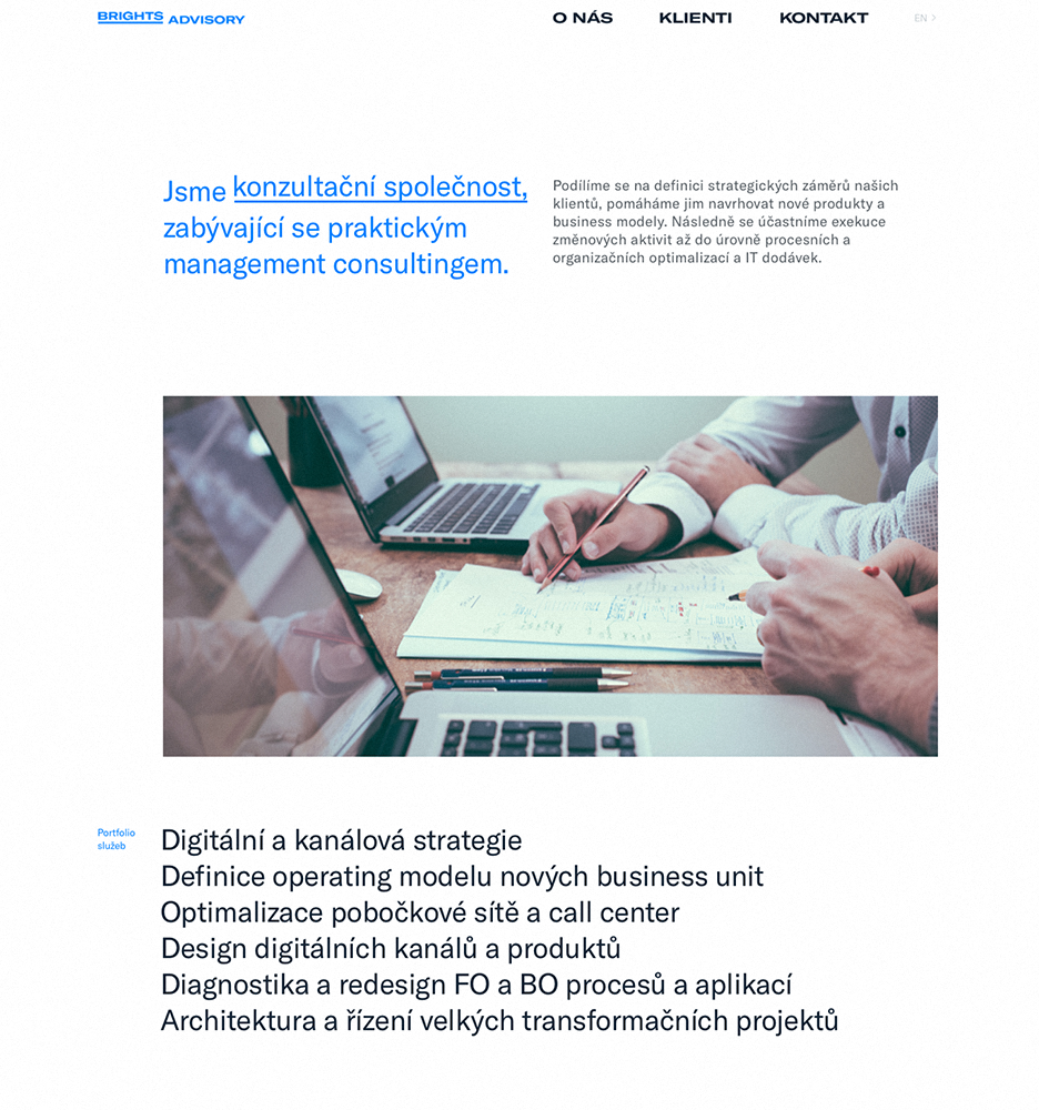
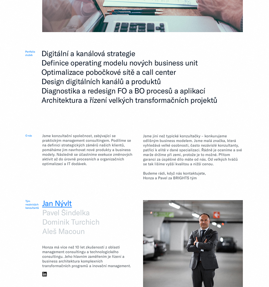
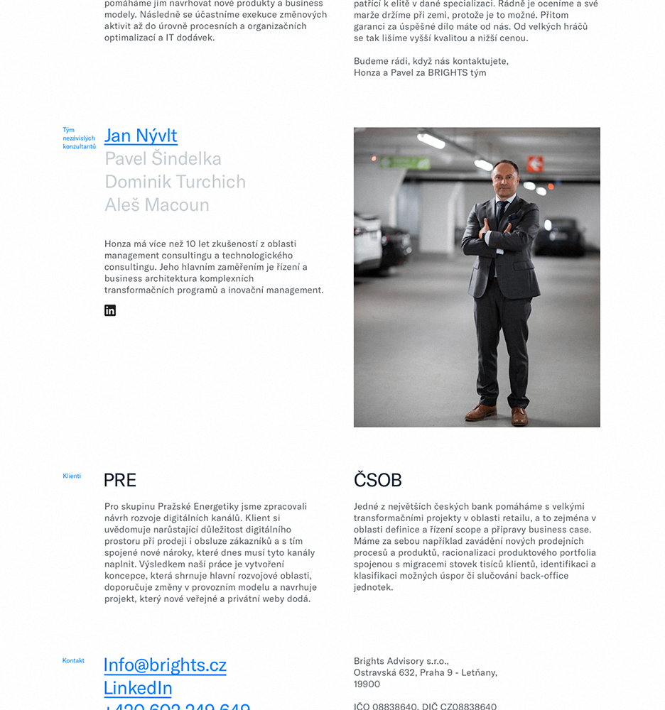
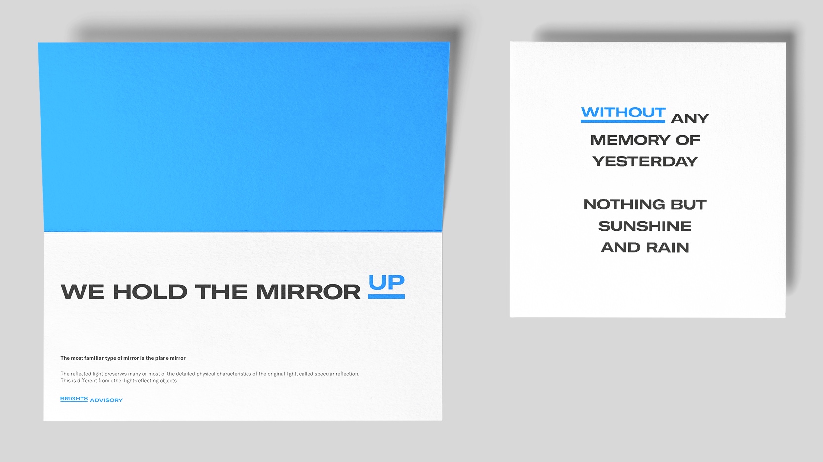
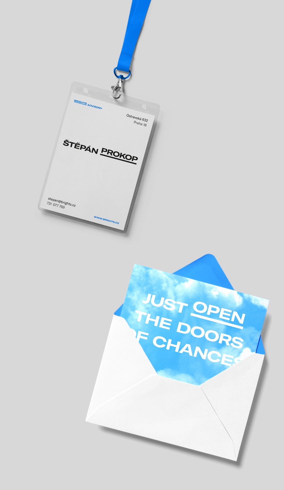
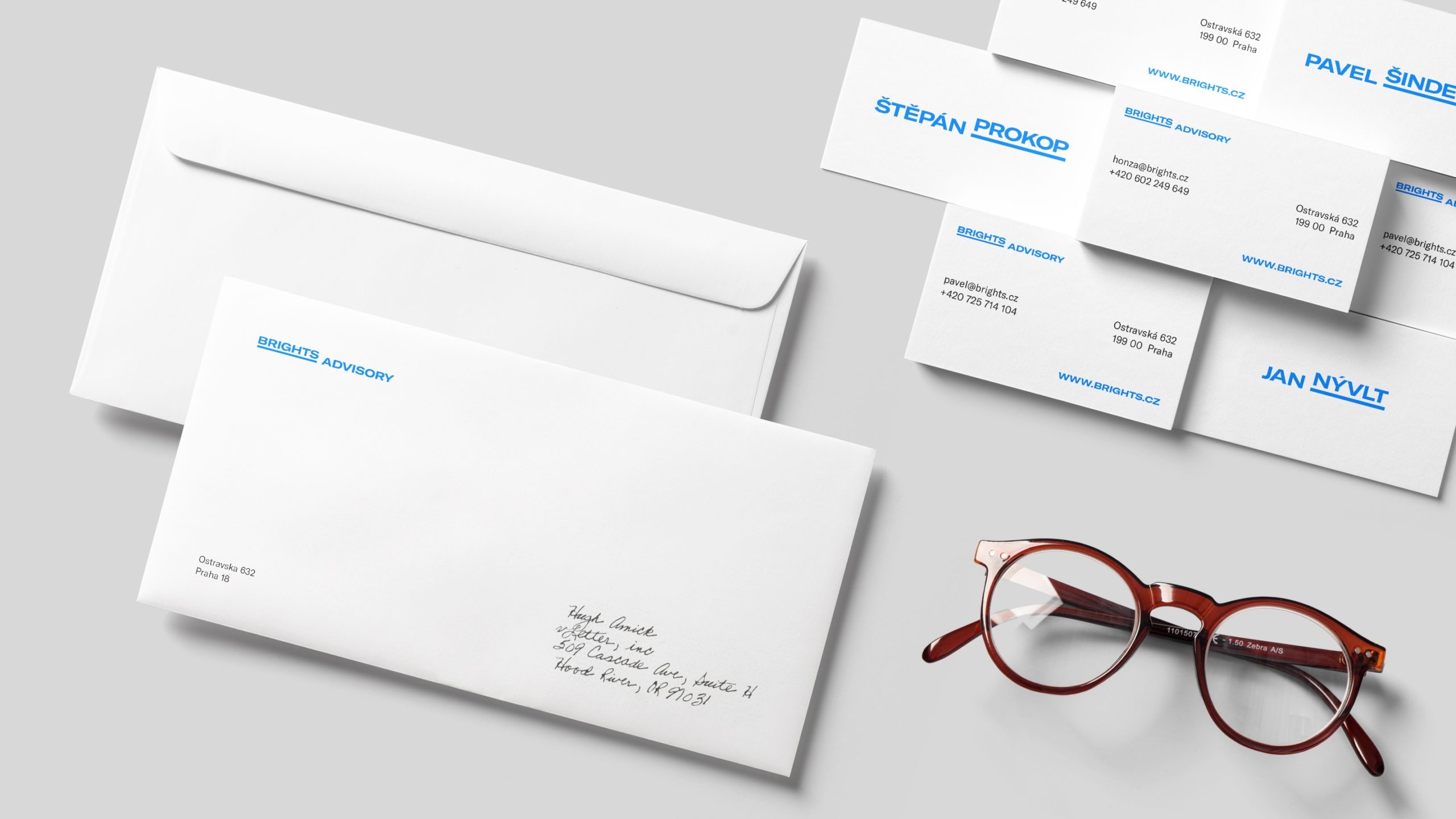
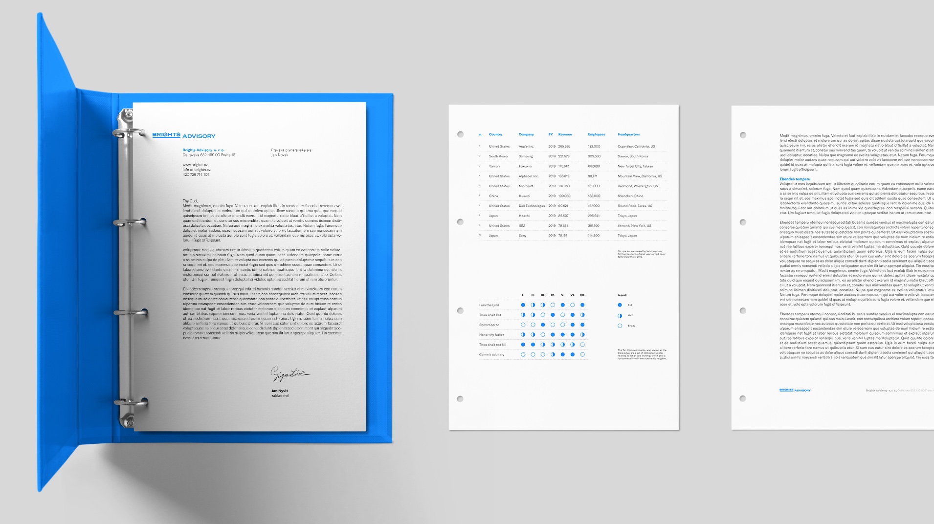
The remaining materials focus on understandability. Function over form. Clarity was the main goal.

Štěpán Prokop
me@stepanprokop.com
+420 731 077 769
ID 74450093
VAT CZ8706091339
Prague, Czechia
Copyright © 2024 Stepan Prokop. All rights reserved.
Projects
The Reimagining of Futuristic HMI (2023)
Leo Express (2018)
PiCube (2024)
52 pages (2023)
Marwick (2015-2020)
Brights Advisory (2020)
MTX Magazine (2021-2024)
About